Improved readability for Results and Documents Copied
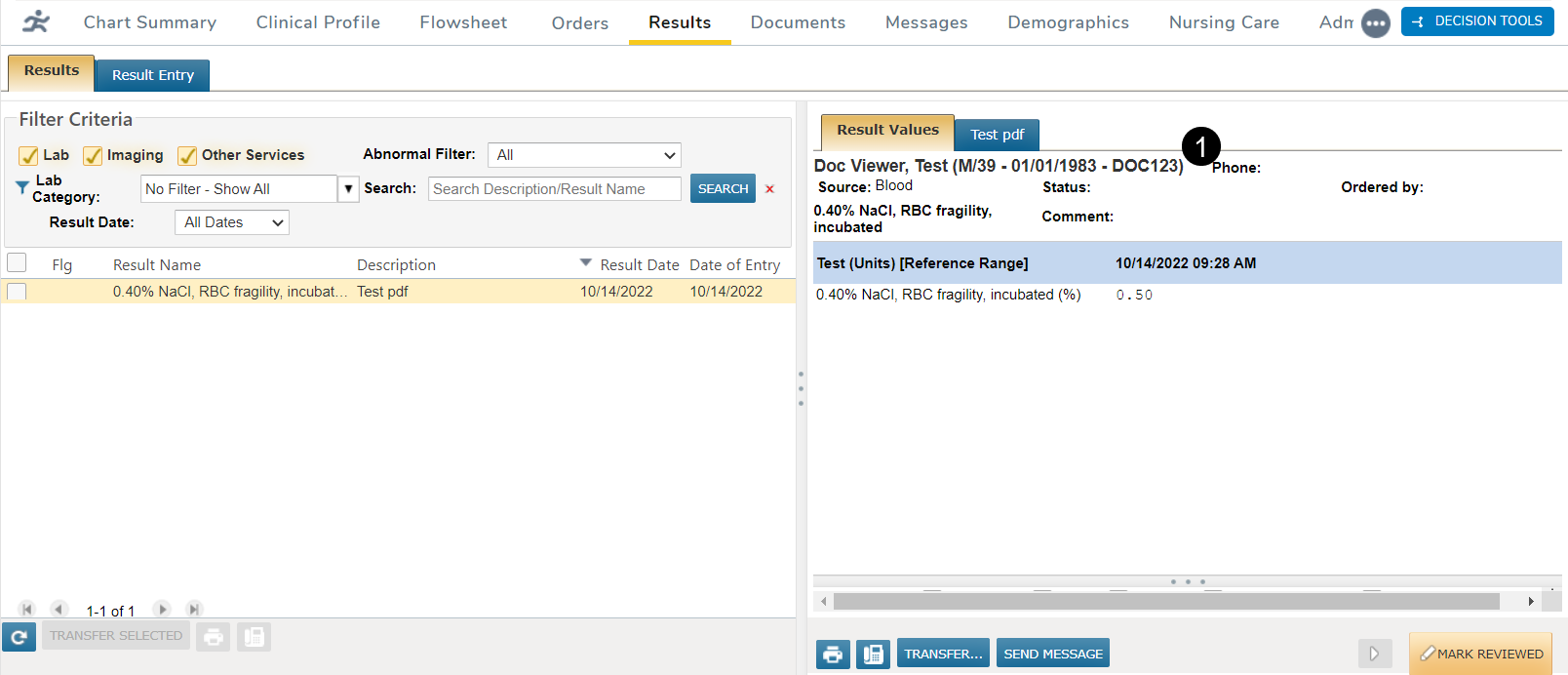
For Results, we improved attachments in the patient’s chart by reducing the amount of space in the header and footer sections, thereby increasing the viewing area of the attached document.
The header information will now display under the result values tab and will not display for attachments (callout 1).
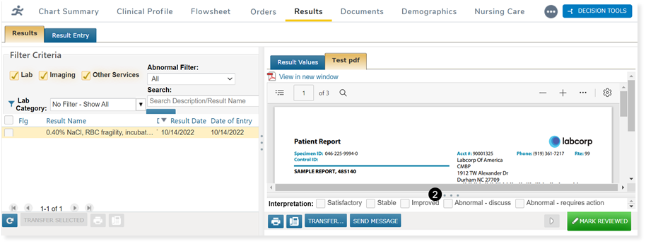
The footer will be collapsed by default and be visible as a single line. The footer can be expanded and collapsed by clicking on the 3 dots on the line that separates the report view from the footer (callout 2).
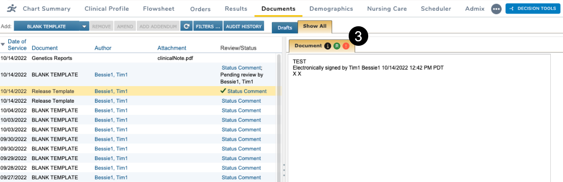
For Documents, we removed the name and date of service from the documents and attachments header in the viewing pane.
Information regarding these documents and attachments can still be viewed by clicking on the icons located on the Document tab (callout 3):
- The black icon displays the item’s name and date of service.
- The red icon displays any errors associated with the item.
- The green icon displays if the item was released to the patient portal.
We also removed any additional white space so that the document tab fills the whole pane.