iKnowMed Generation 2 enhanced design Copied
As a part of our ongoing effort to modernize iKnowMed Generation 2 across all platforms, this release introduces a new look for all headers, tabs, and the patient banner within the product, including:
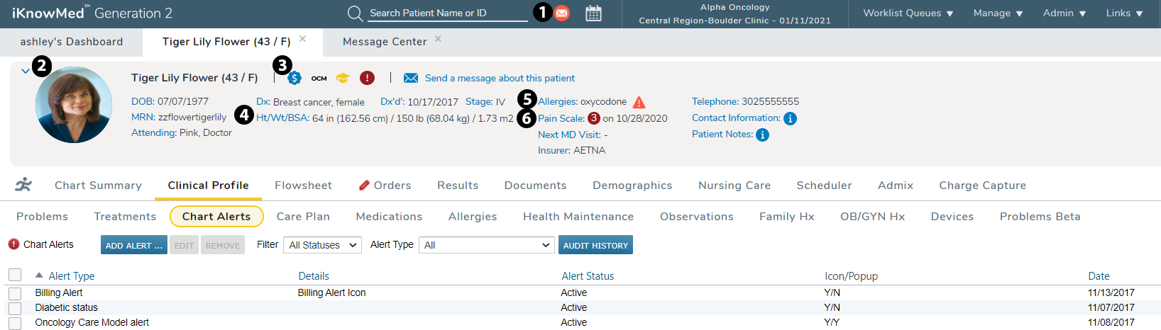
- New icons for normal messages and critical messages (see callout 1) in the navigation bar.
- Rounded patient photos instead of square ones (see callout 2), and patients without a photo will display as a gray icon instead of pink or blue.
- Icons for chart alerts now appear next to the patient’s name in the banner (see callout 3).
- New functionality in the patient banner, such as the ability to see Ht/Wt/BSA units based on your practice preference (see callout 4), new cone icons that allow users to view more information for that field (see callout 5), and a new colorblind-friendly approach to the Pain Scale based on the pain score documentation (see callout 6).
- The footer at the bottom of each page has been removed and copyright information can now be viewed on the About page.