Data Exchange Dashboard Copied
The Data Exchange Dashboards are designed to track the transaction of electronic healthcare data exchanges with third parties. These dashboards provide insight into how many transactions are occurring, who is using the data, and where the data is going. This functionality will assist practices in understanding usage for these transactions and associated charges.
How to access the dashboards
To access the dashboards:
- Navigate to Admin > Data Exchange Dashboard.
- The left-hand navigation lists the third parties that interact with iKnowMed for the electronic exchange of patient data.
- Click on each entry to view the transaction volume data (see callout 1 for example).
- To view Ontada’s API License Agreement, click the G(10) FHIR API Pricing link or icon (callout 2).
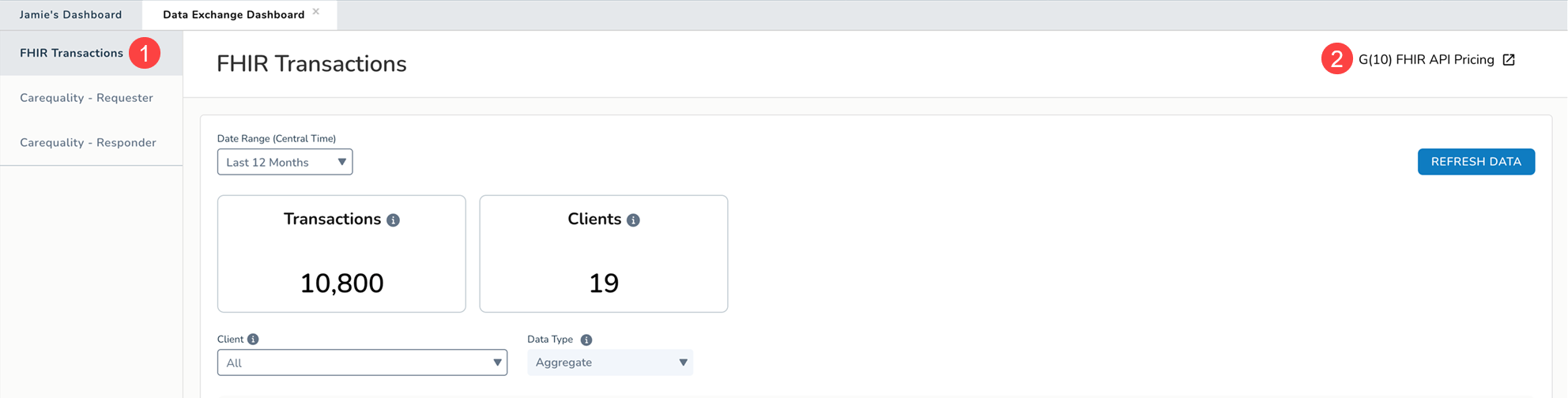
FHIR Transactions
This dashboard provides insight into the volume of transactions over time for the electronic exchange of patient data through FHIR applications.
To use the dashboard:
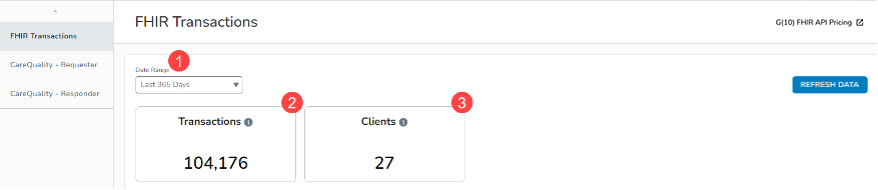
- Set the Date Range Filter at the top of the dashboard to view the provided data for a specific time frame (callout 1).
- Below the filter, certain data points have been called out to provide a quick overview of the transaction volume:
- Transactions: Number of unique transactions that occurred through the FHIR applications (callout 2).
- Clients: Number of unique clients that initiated the transactions through the FHIR applications (callout 3).
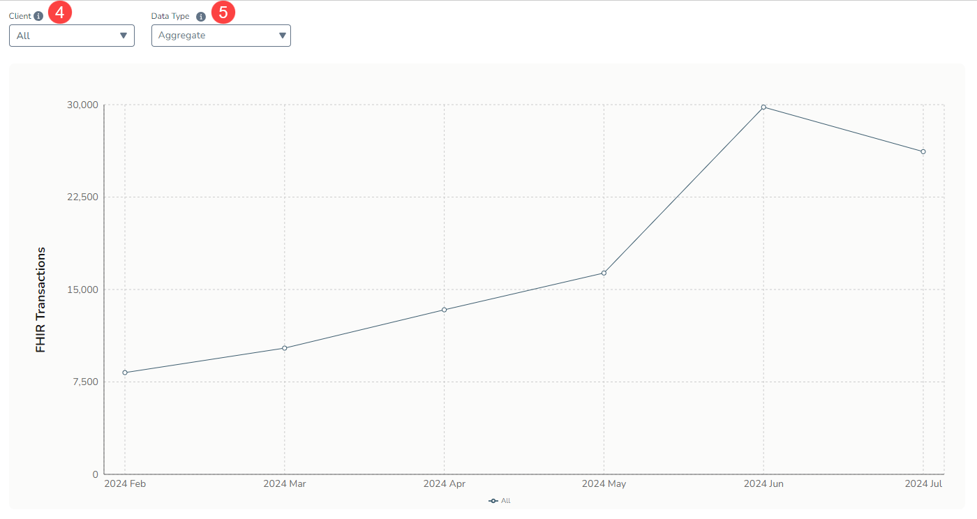
- This dashboard also includes a graph and table that illustrate the trend of these transactions over time.
- Filter both by:
- Client: Filter the graph and table by the users of the FHIR applications. You may select up to five clients at a time (callout 4).
- Data Type: Filter the graph and table by the types of data requested by FHIR application users (callout 5).
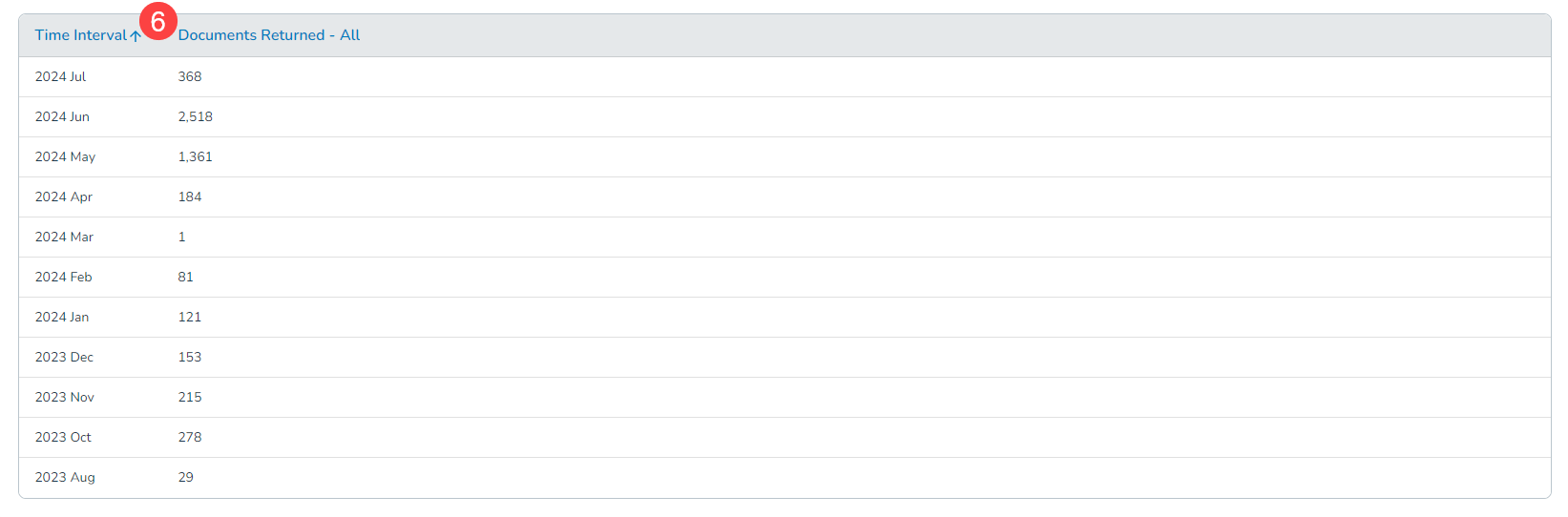
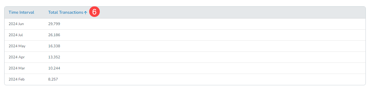
- Lastly, sort the table by column as needed by clicking on each column name for a more customized view of the data (see callout 6 for example).
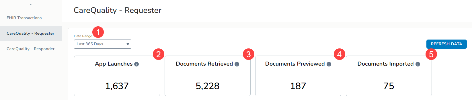
Carequality Requester
This dashboard provides insight into the volume of transactions over time for the electronic exchange of patient data as requested by your practice from Carequality.
To use the dashboard:
- Set the Date Range Filter at the top of the dashboard to view the provided data for a specific time frame (callout 1).
- Below the filter, certain data points have been called out to provide a quick overview of the transaction volume:
- App Launches: Number of unique times your practice launched Carequality to request information from community partners (callout 2).
- Documents Retrieved: Number of unique documents received from Carequality (callout 3).
- Documents Previewed: Number of unique documents previewed after receipt from Carequality (callout 4).
- Documents Imported: Number of unique documents imported to patient charts from community partners via the Carequality network (callout 5).
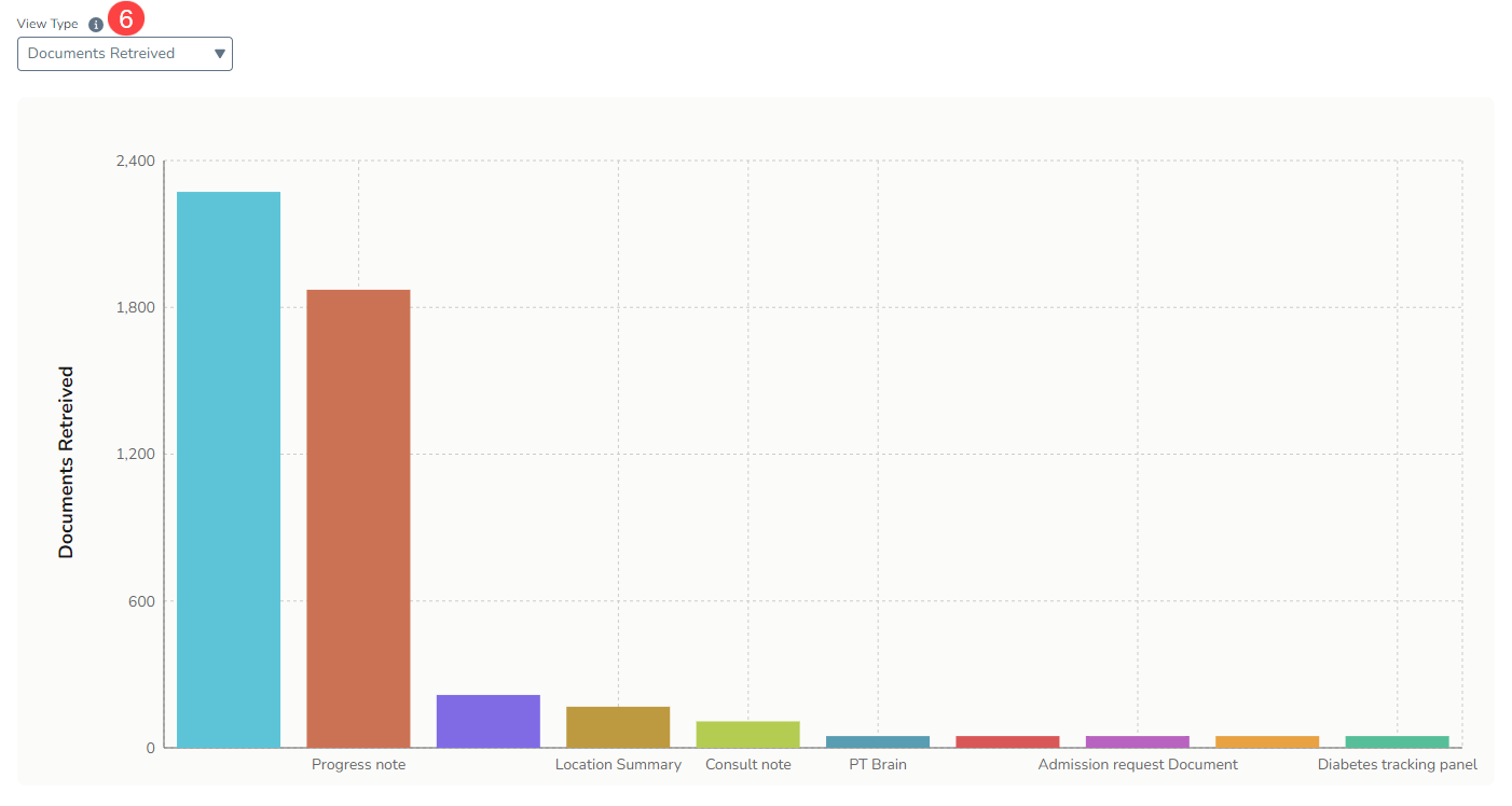
- This dashboard also includes a graph and table that illustrate the trend of these transactions over time.
- Filter both by:
- View Type: Filter the graph and table by the action your practice took on the Carequality documents, e.g., Documents Retrieved, Documents Previewed, or Documents Imported (callout 6).
- View Type: Filter the graph and table by the action your practice took on the Carequality documents, e.g., Documents Retrieved, Documents Previewed, or Documents Imported (callout 6).
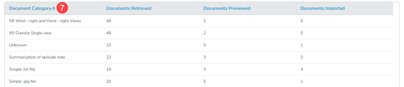
- Lastly, sort the table by column as needed by clicking on each column name for a more customized view of the data (see callout 7 for example).
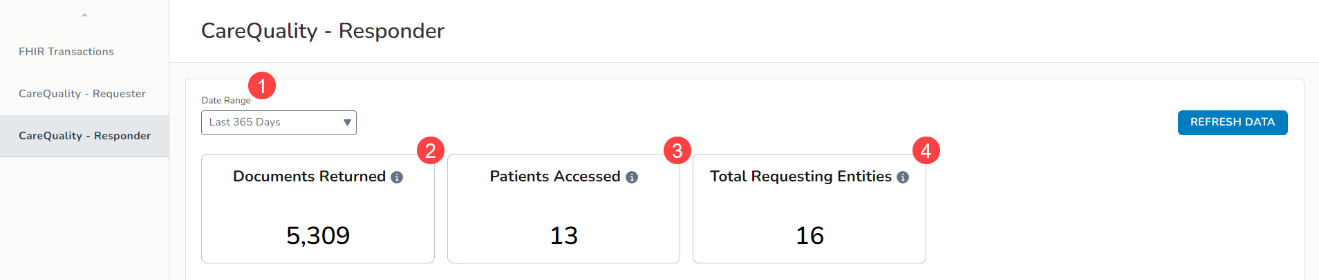
Carequality Responder
This dashboard provides insight into the volume of transactions over time for the electronic exchange of patient data as requested by community partners from Carequality.
To use the dashboard:
- Set the Date Range Filter at the top of the dashboard to view the provided data for a specific time frame (callout 1).
- Below the filter, certain data points have been called out to provide a quick overview of the transaction volume:
- Documents Returned: Number of unique documents sent to community partners after a request through the Carequality network (callout 2).
- Patients Accessed: Number of unique patients for whom community partners requested information (callout 3).
- Total Requesting Entities: Number of unique community partners requesting information from your practice (callout 4).
- This dashboard also includes a graph and table that illustrate the trend of these transactions over time.
- Filter both by:
- Requesting Entity: Filter the graph and table by the community partners requesting information from your practice. You may select one at a time or all (callout 5).
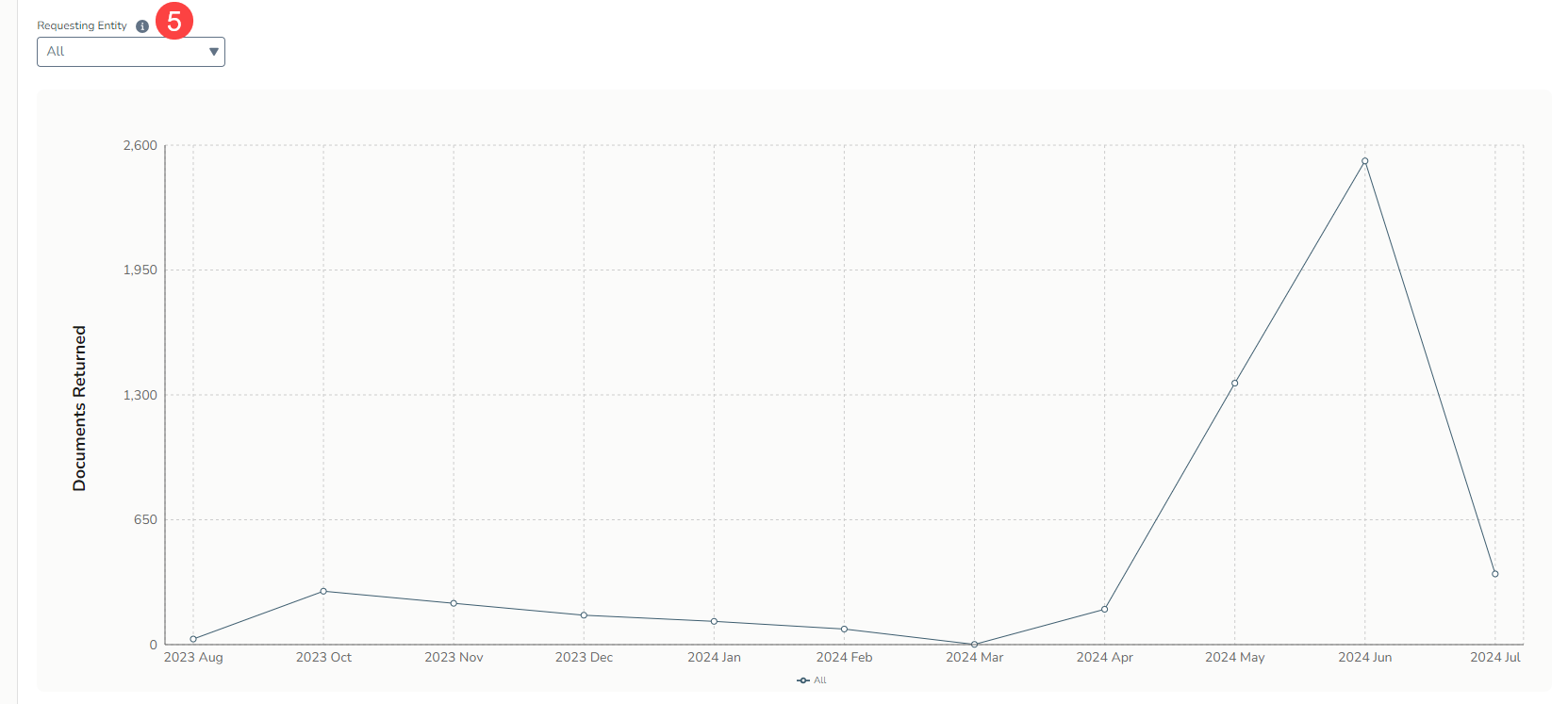
- Requesting Entity: Filter the graph and table by the community partners requesting information from your practice. You may select one at a time or all (callout 5).
- Lastly, sort the table by column as needed by clicking on each column name for a more customized view of the data (see callout 6 for example).